Introduction
There comes a point in every web developer’s career where s/he must face the harsh reality that the world is a big place, and text doesn’t always flow from left to right.
Your sleek and beautiful layout must now be mirrored horizontally, and suddenly you find yourself grimmacing at at the prospect of combing through your CSS stylesheets and having to manually tweak every single property that deals along the horizontal axis.
Floats, margins, paddings, text-alignment, absolute positioning… What a nightmare.
Thankfully, you can automate the majority of this work away leveraging Kraken’s build system, as well as it’s localization functionalities.
Before you start…
This tutorial will use the KrakenJS example on internationalization (i18n)
as a starting point; and enhances it with text directionality support.
If you’re already familiar with it, jump right in, otherwise go read that example first.
This example has been built commit by commit so you can see exactly how the application is changed over time.
The strategy
In a nutshell, we’re going to automatically generate two stylesheets, which are horizontal mirrors of one another. We’ll add support to kraken for determining the directionality of the current user’s locale; and based on that, load the right (or left :) ) stylesheet
I’ll also show you how to tackle some of the tricky scenarios of RTL - LTR conversion.
Getting started
Base setup
Starting from the KrakenJS example on internationalization we’re going to make it look a bit better.
Let’s add a few more elements , some styling and a pacman sprite sheet so we have something nicer to work with:
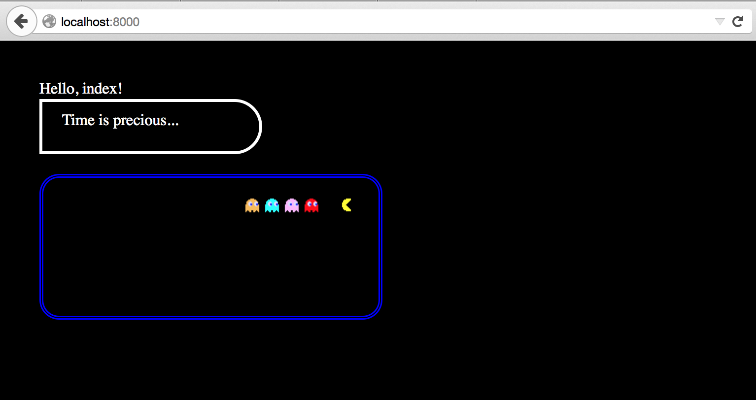
At this point you can build and run the application to see the above:
grunt build && node . will build and start the app. You can see it live at localhost:8000
A few notes:
- The
Time is Precious...box has a border radius property that affects the top-right and bottom-right sides to give it that rounded look. - In addition, it also has some padding to the right
- The Pacman and Ghost sprites are 16x16 px divs that float to the right, and have a background-position property that shows the specific sprite we’re interested in. If you’ve never worked with sprites before, here’s a quick summary
- Pacman sprite borrowed from Google’s pacman doodle
<div class="game">
        <div class="sprite pacman"></div>
        <div class="sprite blinky"></div>
        <div class="sprite pinky "></div>
        <div class="sprite inky  "></div>
        <div class="sprite clyde "></div>
    </div>
.sprite {
background-color: black;
background-image: url("/images/pacman.png");
background-repeat: no-repeat;
height: 16px;
width: 16px;
margin: 0 2px;
float: right;
}
@pacman: -456px 0;
@blinky: -456px -64px;
@pinky: -456px -80px;
@inky: -456px -96px;
@clyde: -456px -112px;
.pacman {
background-position: @pacman;
margin-left: 20px;
}
.blinky {
background-position: @blinky;
}
.pinky {
background-position: @pinky;
}
.inky {
background-position: @inky;
}
.clyde {
background-position: @clyde;
}Adding some RTL content
Let’s add a new Country/Languange bundle to the project, so we can highlight RTL text. In this example we’ll add Israel/Hebrew (he_IL)
Go ahead and rebuild/deploy the application.
This time we can hit: http://localhost:8000/setLocale/he_IL to set the current locale to he_IL.
As you can see, this first approach is not very successful:
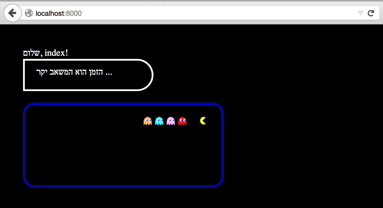
While we are indeed displaying RTL text, our layout looks exactly the same. Our end goal should be a horizontally mirrored layout.
Making the application smarter
Our next step is going to be enhancing the locale middleware that was created in the original kraken example. We want our
application to determine the directionality of the layout, based on the locale.
This commit shows the basic strategy:
- Break up the locale into language and country.
- Check against a list of known RTL languages, and set a RTL / LTR flag.
- Pass the results to the client for proper rendering.
Once we know the proper directionality, our master template
can make use of it by setting the language and dir attributes. (Read more about them here)
This time, things look a bit better:
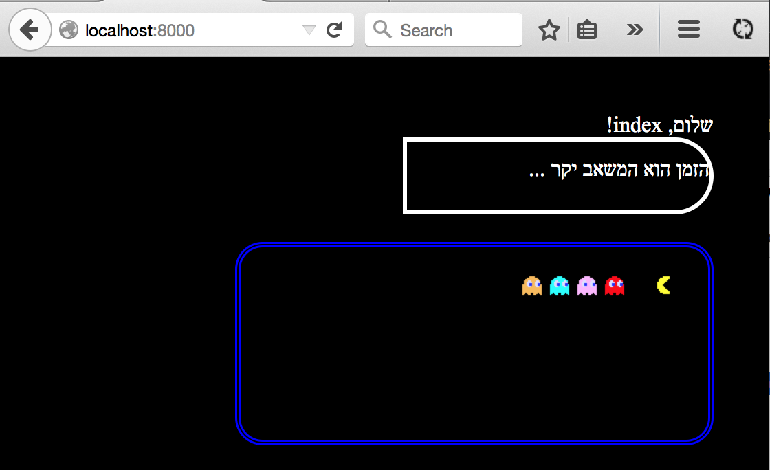
Our page elements are aligned to the right, which is a step on the right direction, however, they are still not mirrored.
For example, look at the rounded border in the Time is precious... box. That should be facing the opposite direction.
Same goes for pacman…
eg: Elements like
.note {
  border: solid 3px white;
  border-top-right-radius: 50px;
  border-bottom-right-radius: 50px;
  padding-left: 20px;
}
Need to be fliped as so:
.note {
  border: solid 3px white;
  border-top-left-radius: 50px;
  border-bottom-left-radius: 50px;
  padding-right: 20px;
}
At this point you’re contemplating the reality that you need to maintain a separate stylesheet to account for all these horizontally specific properties. This is not a problem for a simple application, but most applications that require LTR + RTL support are seldom simple.
Automating the conversion
To make our lives easier, we’re going to leverage the kraken build, specifically the grunt-contrib-less task.
This task can accept pluggins designed for less. We’re going to update the version of this module and install a plugin
that will handle the ltr-rtl conversion for us.
We’re going to use the grunt build to generate two stylesheets. The first, is our default app.css, and the second will be processed through the
plugin, and output as app.rtl.css, with all the horizontal properties flipped.
These are the changes that need to be made to the grunt build in order to generate the second file.
The final step is to allow the template to dynamically load the correct stylesheet based on language direction. For this, we’ll simply leverage dust
{@select key=context.locality.directionality}
        {@eq value="rtl"}
            <link rel="stylesheet" href="/css/app.rtl.css"/>
        {/eq}
        {@default}
            <link rel="stylesheet" href="/css/app.css"/>
        {/default}
    {/select
If you run and build the app, you’ll see we’re almost there:

Text is flowing RTL, horizontal properties are mirrored, but wait…. Why is Pacman chasing the ghosts???
Not a silver bullet, but it helps a lot
If you recall, the Pacman sprites are simply floating divs with a background image. Even though our conversion task correctly flipped the order and direction of the floating divs, it couldn’t do anything about the background image.
If you have any image assets that are meant to be seen / read from left to right, you will need to create a secondary set made for RTL consumption. Lucky for us, the spritesheet that we used, already has a left-facing pacman and ghosts:
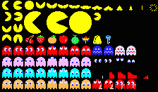
We’ll just have to adjust our bacground properties to display the right portion of the sprite.
This final commit shows how a bit of clever programming can get you a long way.
The grunt build tasks allows us to modify variables defined in the LESS templates. We use this to set a variable that will act as a flag indicating the direction:
modifyVars: {
			 dir: 'RTL'
			}
And by using LESS’s variable interpolation, we can easily manage dual assest from a single .less stylesheet:
@dir: LTR; /*Default direction. Modified externally by Grunt task -> RTL*/

@pacmanLTR: -456px 0;     /*LTR Sprite*/
@pacmanRTL: -456px -16px; /*RTL Sprite*/

@pacman   : "pacman@{dir}"; /*Interpolate with `dir` to fetch correct sprite*/

.pacman {
  background-position: @@pacman; /*Load the correct sprite based on interpolation*/
  margin-left: 20px;
}
Now with this change, we can see that everything has been correctly flipped.
Before

After

Demo
You can fork/clone the final result from GitHub